

Finding the Right Colors for Your New Home
/
Custom home building is all about getting your vision exactly right. Once you settle on the number of stories, rooms, functionality, and layout, it’s time to add the finishing touches. Your home is a blank canvas, waiting to be painted in a palette reflective of your personal style and taste. It’s also important to consider how a color scheme will highlight the architecture of the home you’ve waited so long to have. Use this as a guide for choosing the best color scheme for your custom build, whether you’re working with an interior designer or on your own.
Don’t Be Afraid of Color
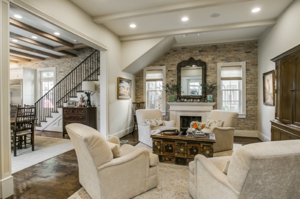
Most people assume the best way to play up the architecture in the room is to choose a neutral hue and let the architecture speak on its own. This isn’t always true. Every architectural period in history has welcomed color, and when done well, color makes your architecture pop. Mantels, built-ins, wainscot, windows, doors, and arched doorways all provide opportunities to provide visual interest to a space. Here are a couple of different approaches:
- For a subtle emphasis, try painting architectural features a shade darker than your primary walls. It provides an understated shift in color while highlighting the aesthetic features. Alternatively, adding a metallic gloss on top of a painted element enhances its natural beauty.
- For those who love a bold approach, consider two different hues in the same room. For example, painting a built-in a shade of green brings an element of modernity and a sense of daring to a space.
Learn the Art of Contrast
Flip open the pages of an interior design book or magazine, and you’ll see boldly contrasting hues are the decorating trend du jour. The key to pulling off this trend is balancing bold with the right mix of neutral. For example, teal and bright yellow are natural friends, but mixing with soft gray helps offset the color palette and prevents it from being jarring to the eye. This is also where painting and decorating get fun. Start with a statement piece – for example, that patterned chevron rug you’ve been eyeing for the sitting room. Pull your colors from that piece, choosing hues for the walls, built-ins, and furniture. Don’t be afraid to carry your contrast to textiles – for example, contrast a luxe velvet sofa with a plucky, modern canvas wingback chair.
Don’t Forget the Ceiling
People often discount the ceiling, painting it white and forgetting about it. But think of your ceiling as your “fifth wall,” as it’s equally capable of creating a mood in your room. While a light-colored ceiling adds height and makes a room seem airy, a darker color choice adds a sense of intimacy and evokes a feeling of cozy. For example, a rich shade of red in the dining room or a warm brown in the den makes the space feel inviting and naturally brings people together. This works well in rooms with ceilings that are 11 feet or higher. If your ceilings are, say, 8 or 9 feet high, choose a lighter shade, like a soft blue, for a similar effect.
Choosing the color palette for your home requires planning, but it’s also a fun part of building. Spend some time playing with different hues, and don’t forget to paint a test strip on the wall to see how it translates to your space and amount of light. Be sure to give Tony McClung with Luxury Homes by Tony McClung a call at 214-668-7802 for any questions about designing your new custom home.